Burberry redesign
I decided to redesign the Burberry logo because I am very familiar with the brand ,however I have always felt that the current logo looks too plain for a heritage luxury brand. Through some basic research, I discovered that Burberry’s original 1901 logo had a knight on horseback holding a flag with the word “Prorsum,” meaning forward. I was drawn to the picture and strong medieval theme of this design, which inspired me to reintroduce the medieval , fantasy concept into a modern logo.
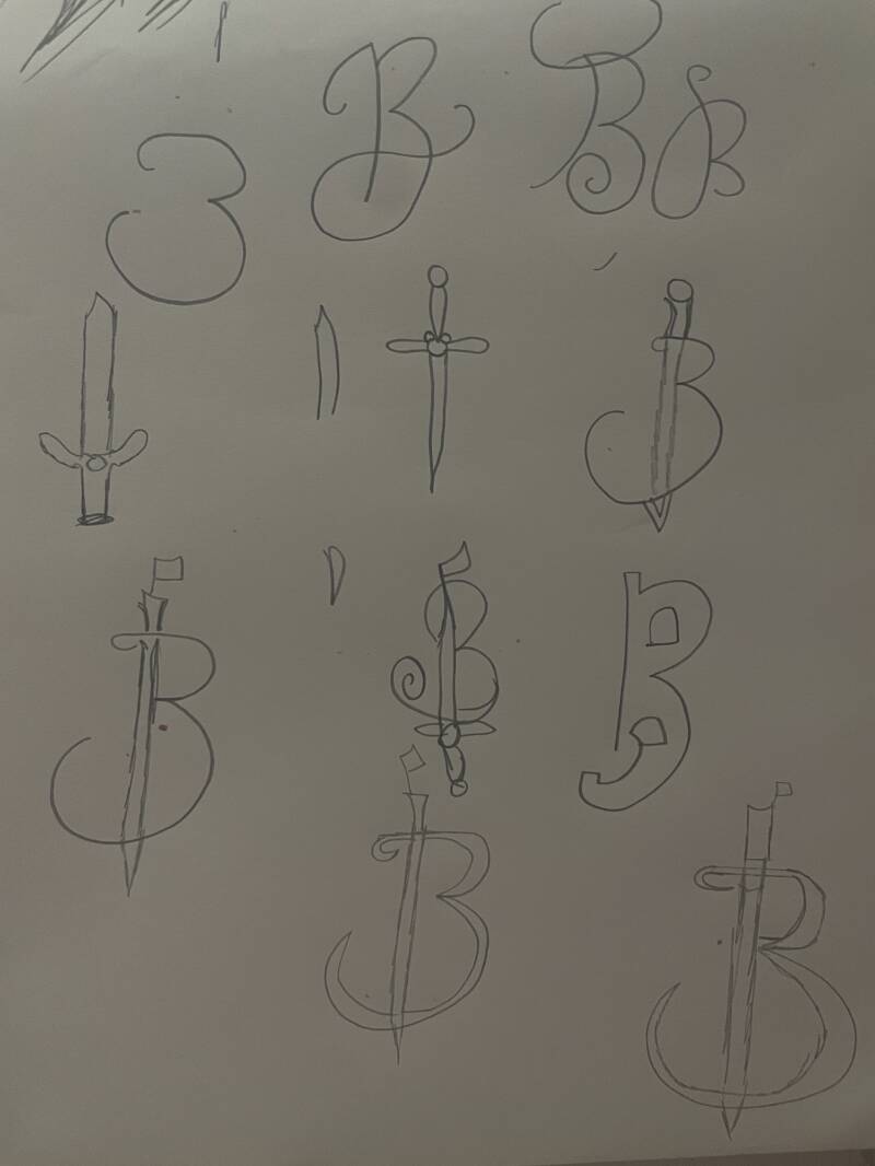
Sketching ideas
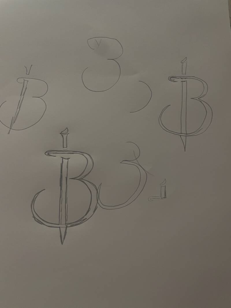
I started the redesign process by sketching a variety of rough ideas, allowing myself to experiment before making my decision on the final concept. My initial direction explored a more playful, curved approach, using a curly ‘B’ but still incorporating the medieval theme . However, this style didn’t feel right with Burberry’s luxury identity. As the sketches developed, I thought that a sharper, more angular form expressed strength, structure, and sophistication more effectively which makes it a better fit for Burberry.
The final design combines the earlier sketches into a bold, structured mark that merges the letter ‘B’ with a sword symbol. The sword acts as the spine of the logo, creating a sense of strength, direction, and heritage, while the form of the ‘B’ softens the design with elegance . This balance between sharp and curved elements reflects Burberry’s identity as a luxury brand but presented in a modern, bold way. The medieval influence is subtle but still impactful , allowing the logo to feel timeless rather than decorative.

Pen tool
After finalising the sketch, I went over the design digitally by tracing over it using the pen tool. This process allowed me to clean up the lines, sharpen the angles, and create neater curves, resulting in a more polished and professional finish. Using the pen tool also gave me more control over symmetry and allowed me to elevate the look even more .
I then experimented with black, burgundy, and beige, as these colours felt most suited to Burberry’s identity. Black gave the logo a clean, high-end feel, burgundy added depth, and beige referenced the brand’s iconic trench coats. Testing these colors helped me decide which worked best while keeping the design simple and versatile.
In the end, I chose burgundy as the final color, I haven’t seen much of the Burberry logo in this color and it felt the most luxurious but still aligning with the medieval inspired design.


Mockups and evaluation :
After finalizing my redesigned logo it was now time to use mockups to help visualize the idea, mockups are useful because they show how a design would look in real life, not just a flat 2D logo that's on a screen.


I did two light but effective mockups , I chose a scarf because Burberry is particularly known for their cashmere check scarves , which makes this an appropriate product to showcase the logo in a realistic brand context. I also felt like wallets are a suitable product to showcase the brand as Burberry produce a range of leather accessories that reflect the brands luxury.
Overall I am pleased with the final outcome of this project, the logo reflects Burberry's heritage while still feeling modern and luxurious. The whole process helped me understand the importance of refining and going over ideas through brainstorming, sketching and then digital development, by limiting the mockups it allowed me to keep the project focused. If I were to develop this idea further I would test the logo across more products and formats to ensure consistency and versatility.