Residential room redesign
I decided to make my own brief which was redesigning a residential room. My goal was to use the room to it's full potential but still keep the same furniture, my inspiration for this brief was having a lot of friends in uni accommodation's with little to no space and furniture scattered without thought.
Initial room
I sketched out a floor plan of a typical uni room with a typical rental room size being 9.84 x 7.87ft, the floor plan has been produced at a scale of 1:25, where 1 cm on the drawing represents 25 cm in real life. All furniture sizes were calculated by multiplying the scaled measurements by 25. The bed measures 190 cm × 85 cm, the desk measures 120 cm × 60 cm, and the wardrobe measures 65 cm × 47.5 cm.
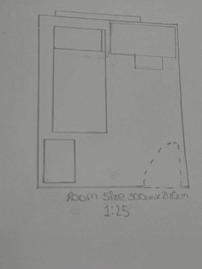
This is the original placement of the furniture , it is very cluttered and not thought out , light is being blocked, study area is too close to rest area and looks overwhelming which results in restricted circulation and unpractical use of floor space.

I really liked the bed in this corner because It's in the corner, away from the window and yes you will see it when you enter the room but the door swing isn't touching it so thats what's important. I didn't like the wardrobe being in front of the window as it's tall and will block light.
I decided to draw the bed , wardrobe and desk and cut them out then move them a long the same room but an empty version. I did this so that I could visually see what furniture would be suitable in different areas of the room . I started moving the furniture and visualizing what the outcomes could be or how It could affect day to day tasks
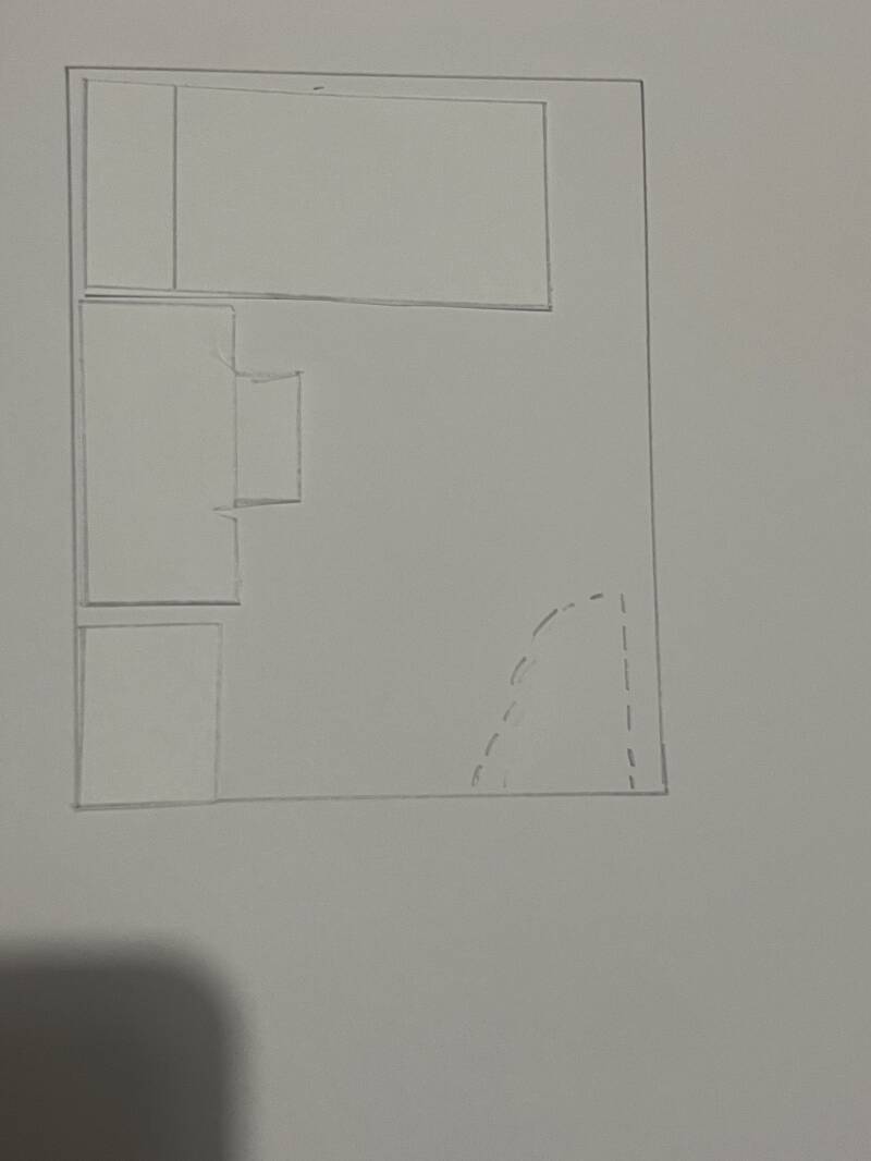
This was my first thought , there is a good amount of space but there isn't really any balance , the bed is too close to the desk and could be dangerous but also feel tight and anxious due to having your study area too close to the area where you rest and relax.

This was the final result and final placement of all the furniture , I was set on the bed being in the right corner because I feel like it looked the tidiest there, the desk being faced away from the bed is key because that way study and relaxing time are not super close to each other and almost like they have their own zones. I liked the idea of the desk being next to the window which is good for you especially being sat at a desk studying but it's also placed in a way that it doesn't block the light from being let in . The wardrobe is put away in the left corner, doors are not clashing with any furniture and has a nice gap between the desk.

This idea was slightly better but I didn't like how the bed was under the window ( not drawn in these images) because the light should be let in when you enter the room instead of it being blocked by a bed, another downside would be accessing the wardrobe ,when opening the wardrobe doors it could be a problem of feeling too tight between the bed space and wardrobe doors, not being able to pick clothes calmly and effectively .
summary:
I really enjoyed this brief because it kept me thinking on ways to make the bedroom better, how each idea/placement had problems but could be solved . I learned how to analyze an existing layout, identify spatial issues and apply design principles to create a more functional small room, it shows how small changes in the layout can be a big improvement on comfort and access.