Cafe redesign
This is a slight redesign of a real independent cafe, combining brand identity and interior design to create a cohesive, contemporary experience. The aim is to strengthen the space’s visual presence, improve functionality, and reflect its values and target audience.
I chose an independent cafe in my area and from what I can see, I like the big wide window on the outside, it looks inviting and lets a lot of light in. The interior design looks confusing like a cross over of desert lounge & cafe rather than equally balancing the two , they need to be tied together instead . Dessert café trying to look luxury when it should be a warm desert cafe they people want to stay in, a ‘see you next week’ vibe .


Color pallet
The first step to the redesign was making a color pallet to visualize what colors would look good together and the color palette I chose was inspired by dessert tones such as caramel, custard, and berry, balanced with warm neutrals to create an inviting but modern looking café. The deeper accent of color adds richness and contrast to give a luxurious desert/ cafe feel .
I then labelled the original interior of the cafe and visualized with my color pallet , where and how I could use my colors.


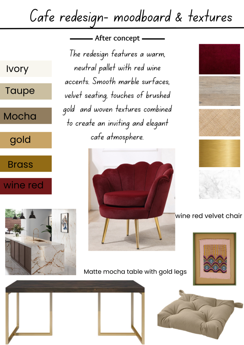
Mood-board
I created this mood-board to explore an elegant cafe redesign that feels inviting but still modernized . I chose a neutral base from my color pallet such as ivory, taupe and mocha to create the calm base, I then added wine red as the bold bright color to bring depth and warmth. The materials - marble , velvet , brushed gold and woven were perfect textures to balance luxury with comfort so the space feels more welcoming than formal.
Drawings :
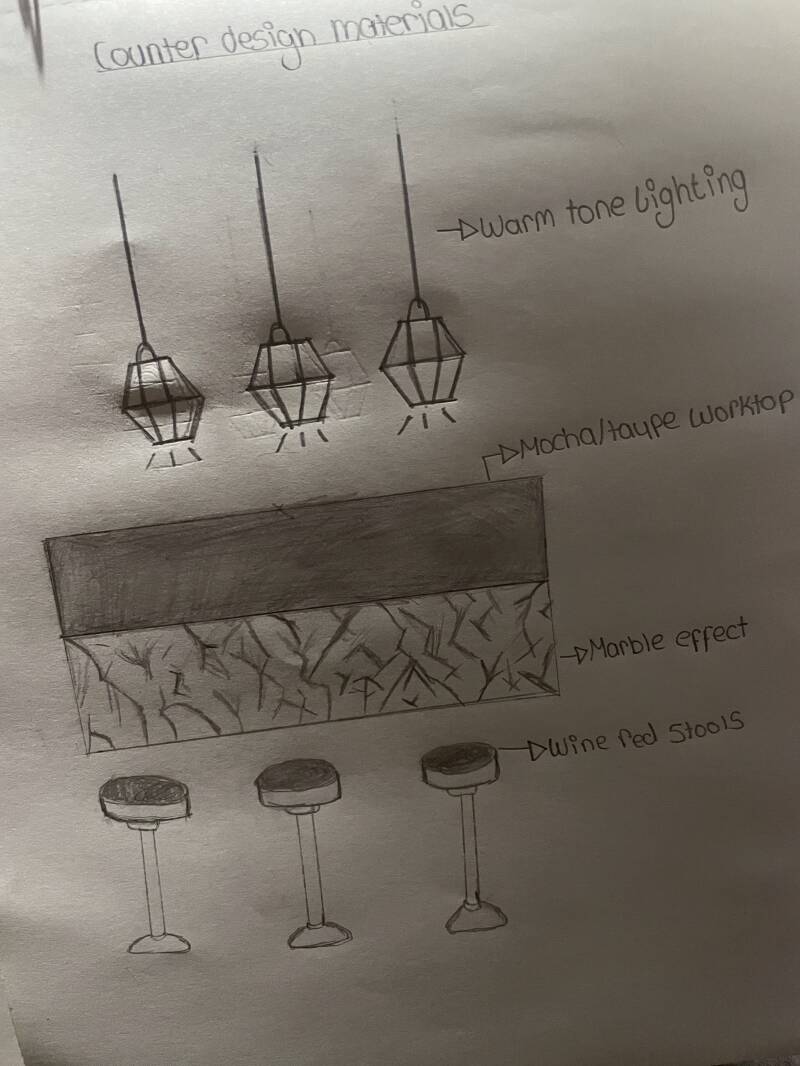
This drawing was the counter design and materials in more detail, showing how the moldboard translates into a physical cafe space. My focus was to combine warm tones and textures to make the counter a central feature . The mocha and taupe tones add a strong , practical base while the marble effect front adds visual appeal with a sense of luxury .
I added warm tone lighting above the counter to create a welcoming atmosphere and to highlight the materials below. The lighting helps soften the space and makes the counter area feel more inviting than harsh.
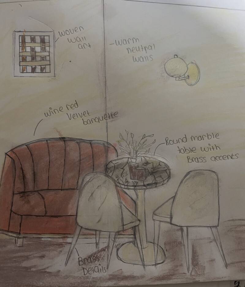
Corner space drawing:
This final drawing visualizes how the cafe redesign would feel when experienced by customers . I tried to focus on creating a cosy , intimate seating area using a wine red velvet banquette as a focal point, supported by warm neutral walls to keep the overall space balanced and calming .
I included a round marble table with brass accents to echo the materials used throughout the cafe redesign , helping create continuity across the space.
The layout brings comfort and a social atmosphere which makes it a space people want to sit and stay longer .Soft textures , warm tones and layered lighting were all chosen to really enhance the whole atmosphere.
To conclude: This cafe redesign successfully brings together color , texture and material to create a warm and inviting environment that balances the cafe/desert feel that I thought the original design was lacking. Starting from the mood-board, I developed the idea for which materials could be used, sketching where the materials could be used and researching different color combinations that bring warmth but depth. The final outcome reflects a balance between elegance and comfort, showing my ability to translate an initial idea into a cohesive interior space focused on the customers experience.